In this project I was tasked to create a hierarchical type system in order to redesign an outdated first aid manual. Provided disorganized and extensive first aid steps for over 15 different ailments, I came up with a type and hierarchical system to house all the information in a small booklet intended for college students. The booklet also includes illustrations and typographic humor to add depth to the piece.
Creating Hierarchy with Type and Weight
I began the process by working with physical bandaids to come up with a complex grid system. I used the curves and many different shapes and patterns that make up a bandaid to create multiple different iterations of a grid.
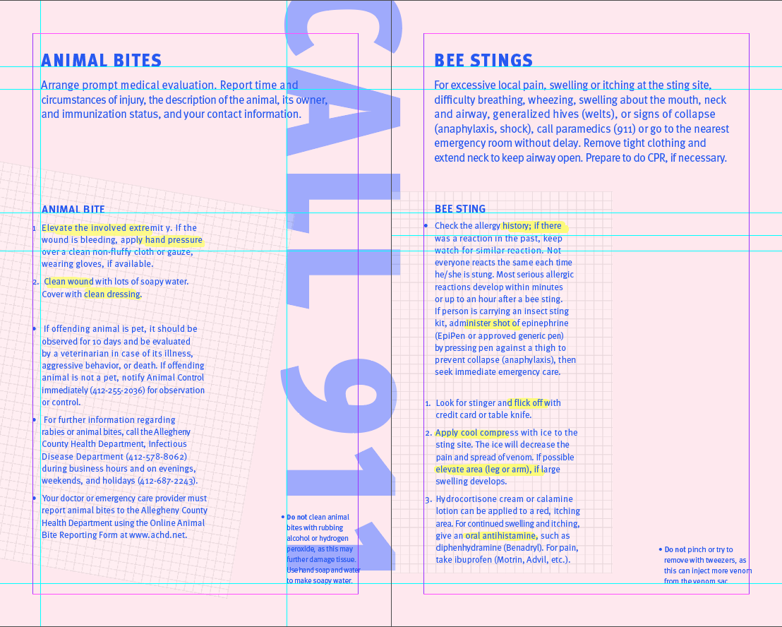
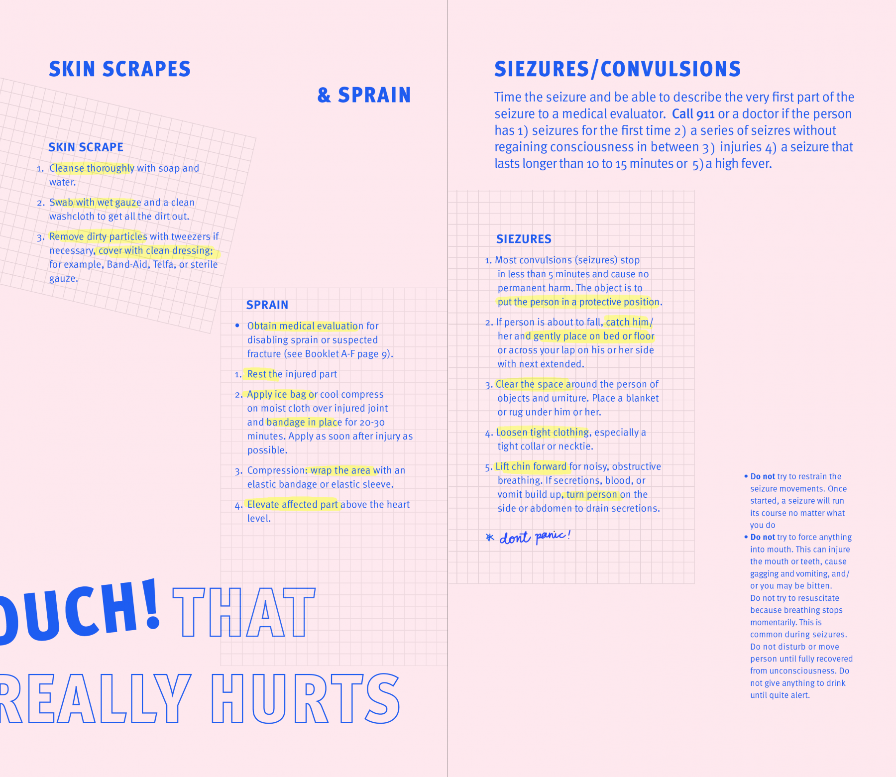
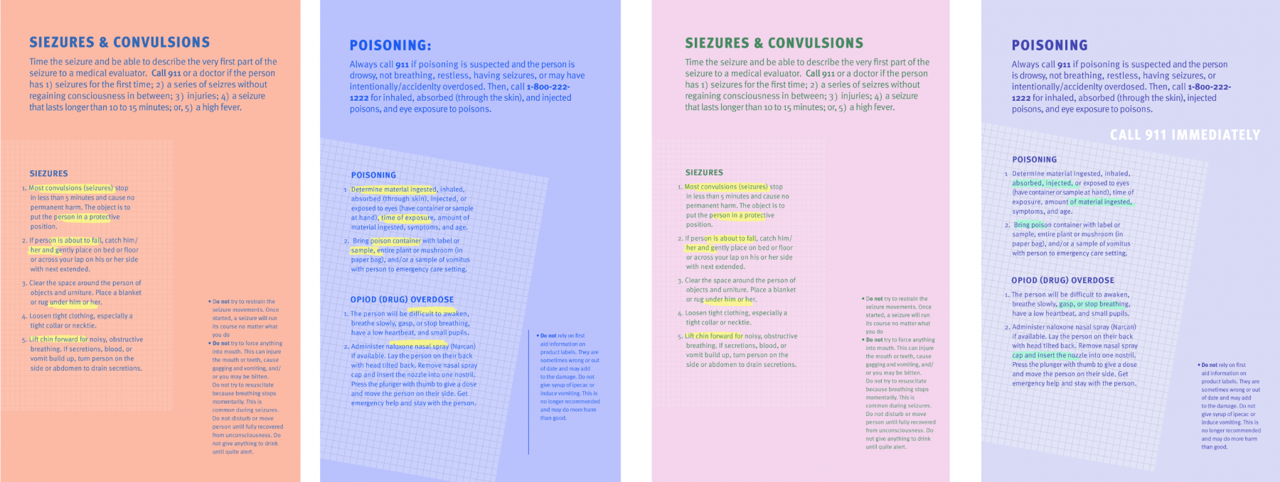
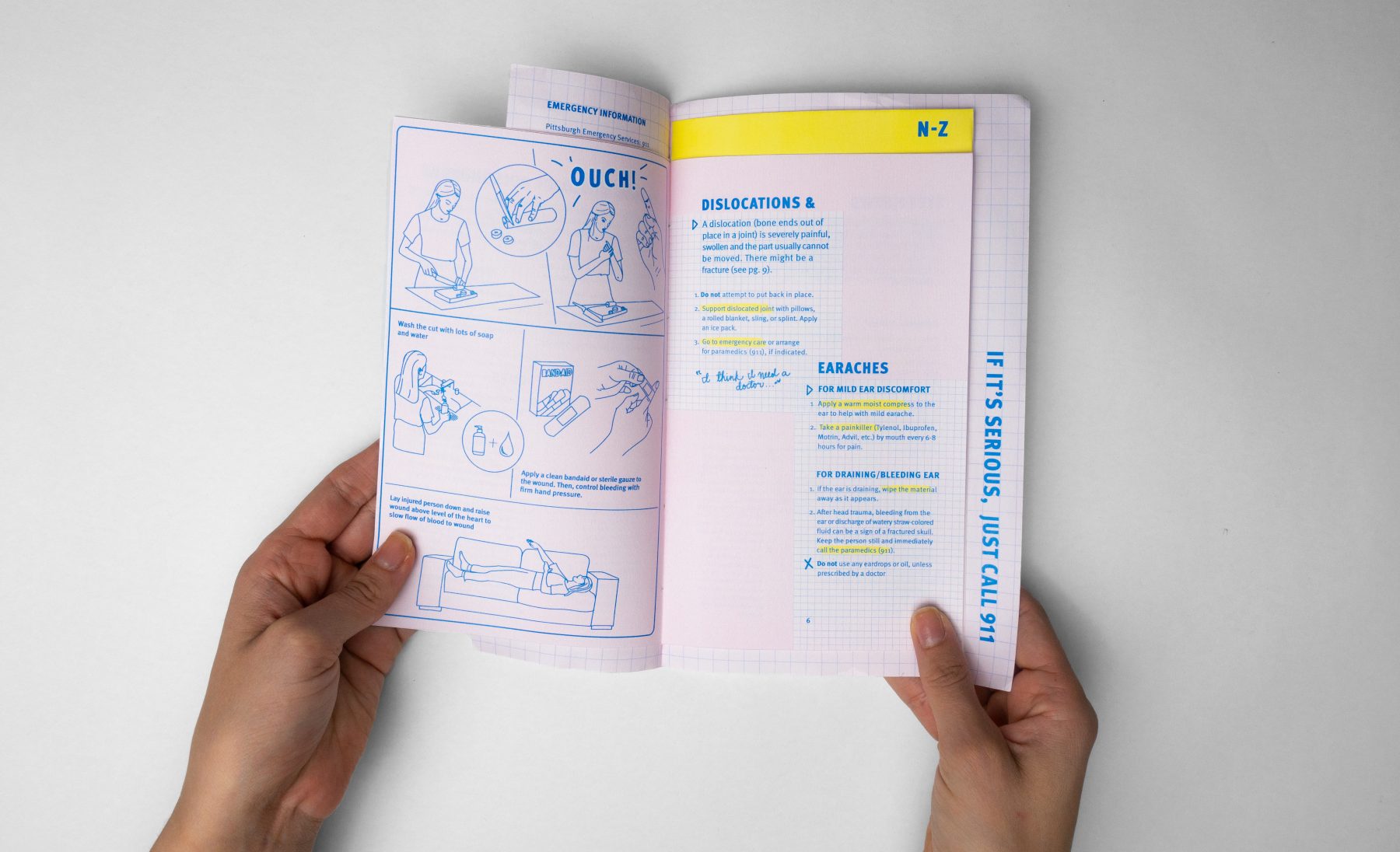
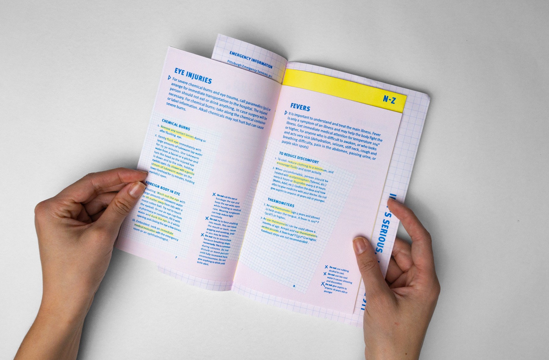
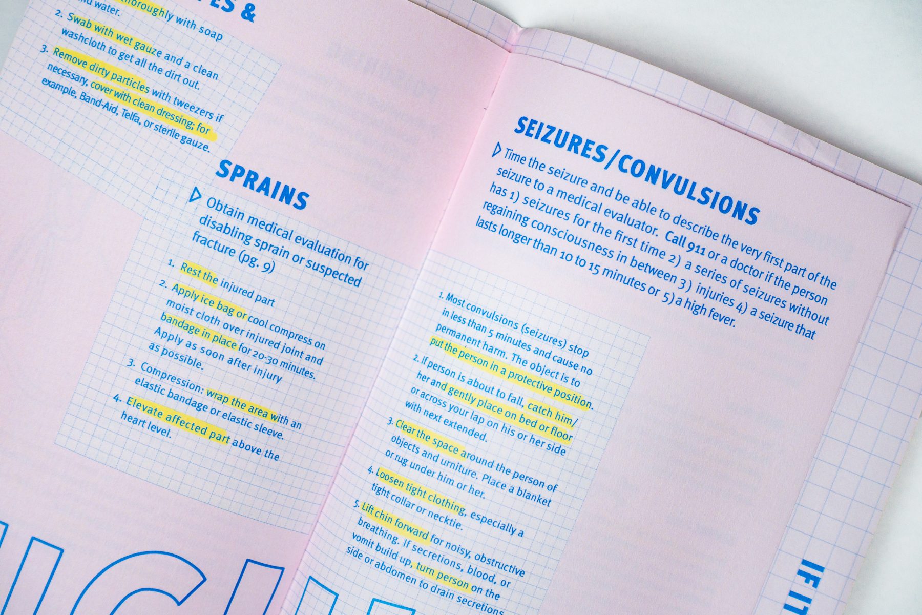
At the same time, I worked to resolve content inconsistencies and find similar groupings and subheadings that could carry throughout each ailment in the content. Through this content research process, I identified three main groupings that were evident in each ailment: foreword information, step-by-step instructions, and “do not” warnings. These groupings in addition to type and color studies guided my iterative process as I worked to create hierarchy.
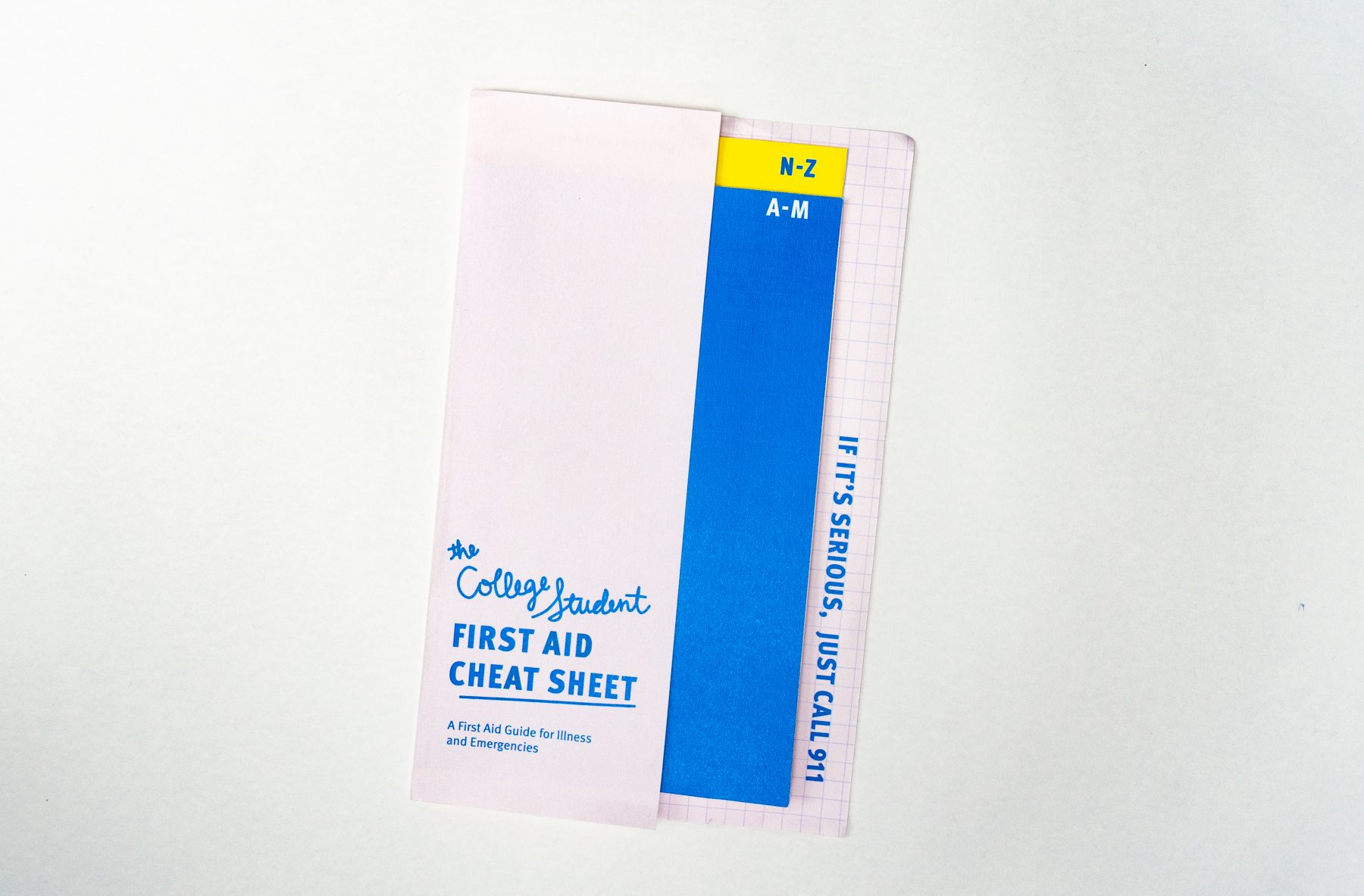
Working from this point, I began iterating on booklet size, typeface, and graphic elements to create a system that would work for a variety of content.
Designing for a Specific Audience
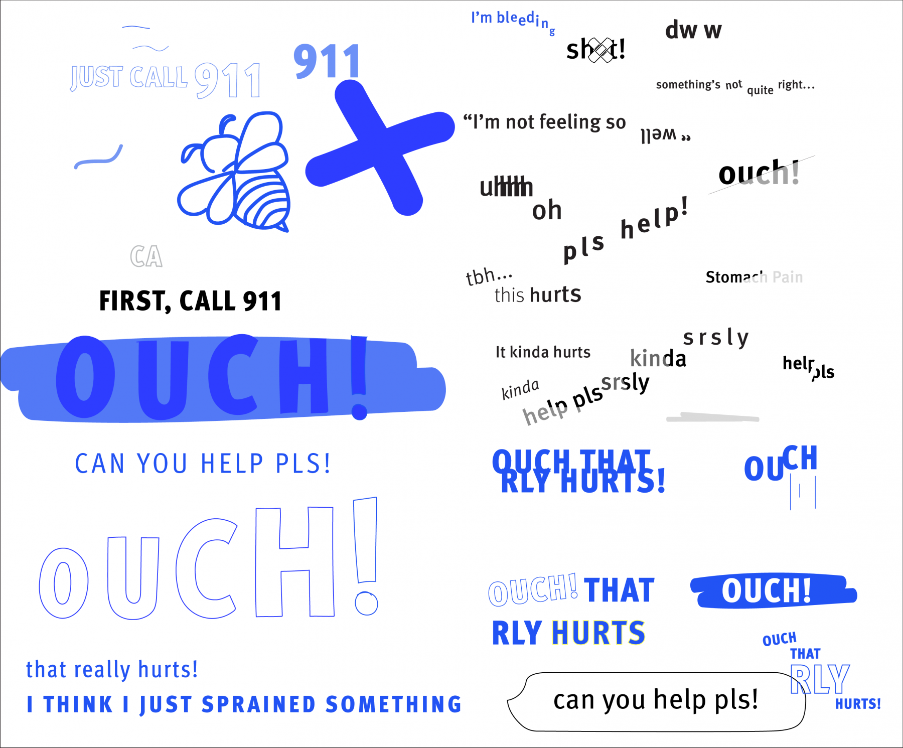
Another facet of the project was to define and design for a specific audience. I identified new college students as my audience as they are a group of people that are learning to live and care for themselves. This decision guided my entire process as I constantly looked to my audience to guide my design decisions. From the typeface used to the graphic elements that are prevalent throughout the booklet, I aimed to design a first aid manual that college students would be drawn to and, most importantly, not afraid to interact with.
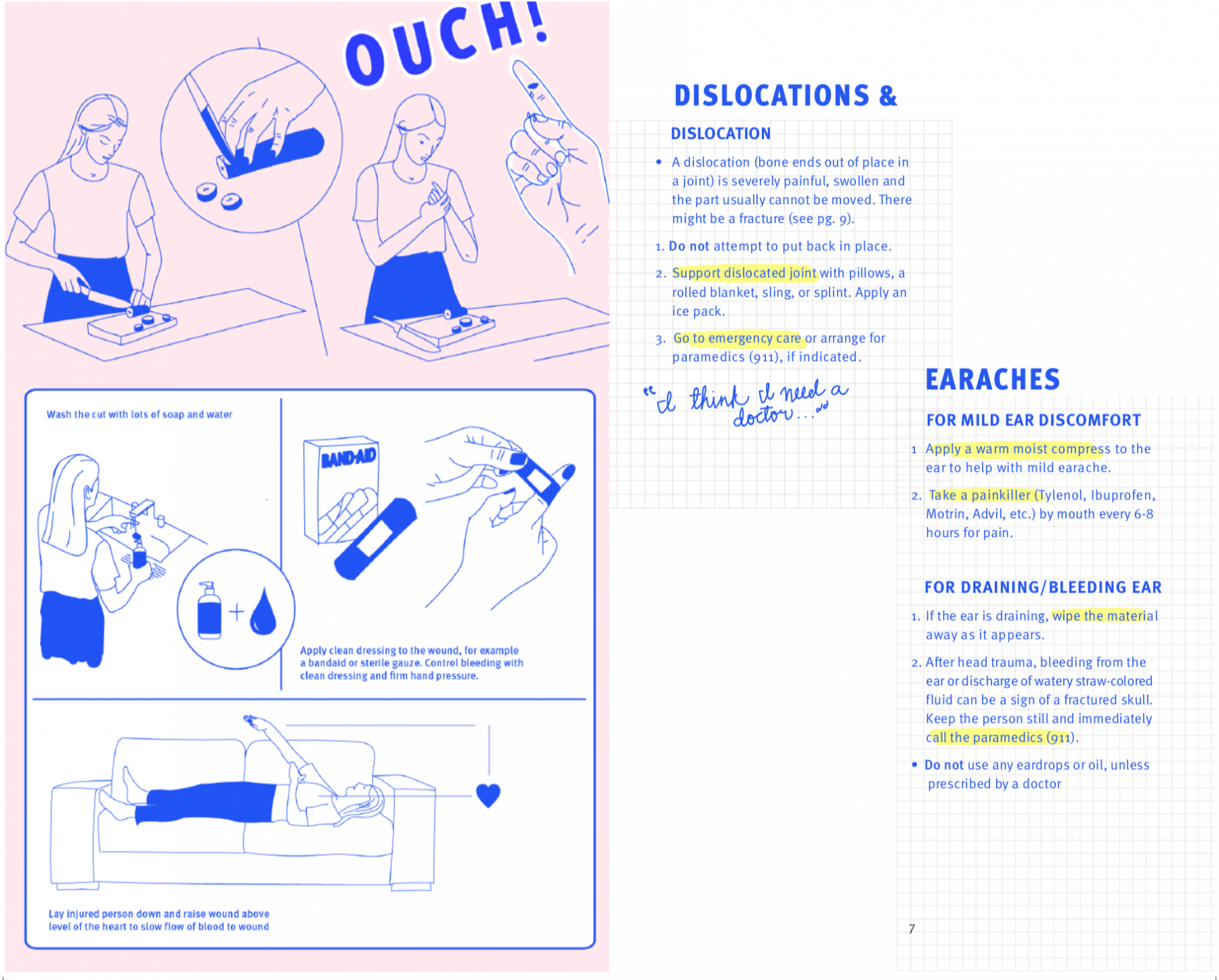
I began by playing off of students’ voices — tweaking the content to make it more approachable and relatable. However, I soon realized that besides content adjustments, graphic elements needed to be introduced to catch the viewers attention. Playing off of the inspiration of textbooks (something that college students are very acquainted with), I started to work with grid paper as an added texture as well as highlighting. These graphic elements helped add hierarchy and drew students into the most important steps of the first aid manual.
My audience also guided my decisions when adding color to the piece. After experimentation with various color contrasts, I decided to use vibrant pops of color throughout the manual to add a playful twist to the content. Though it was important to me to remain serious, since the project was dealing with sometimes very serious ailments, I also intended the first aid manual to be approachable and relatable to college students.
Tying it all Together
The final steps of tying the whole manual together included adding elements such as illustration and unique graphic elements to create variety in the 20-some pages of the first aid manual. These illustrative elements add meaning to some pages; on other pages, the drawings help direct the readers eye through a page.