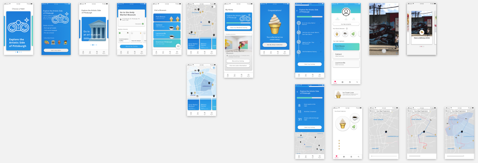
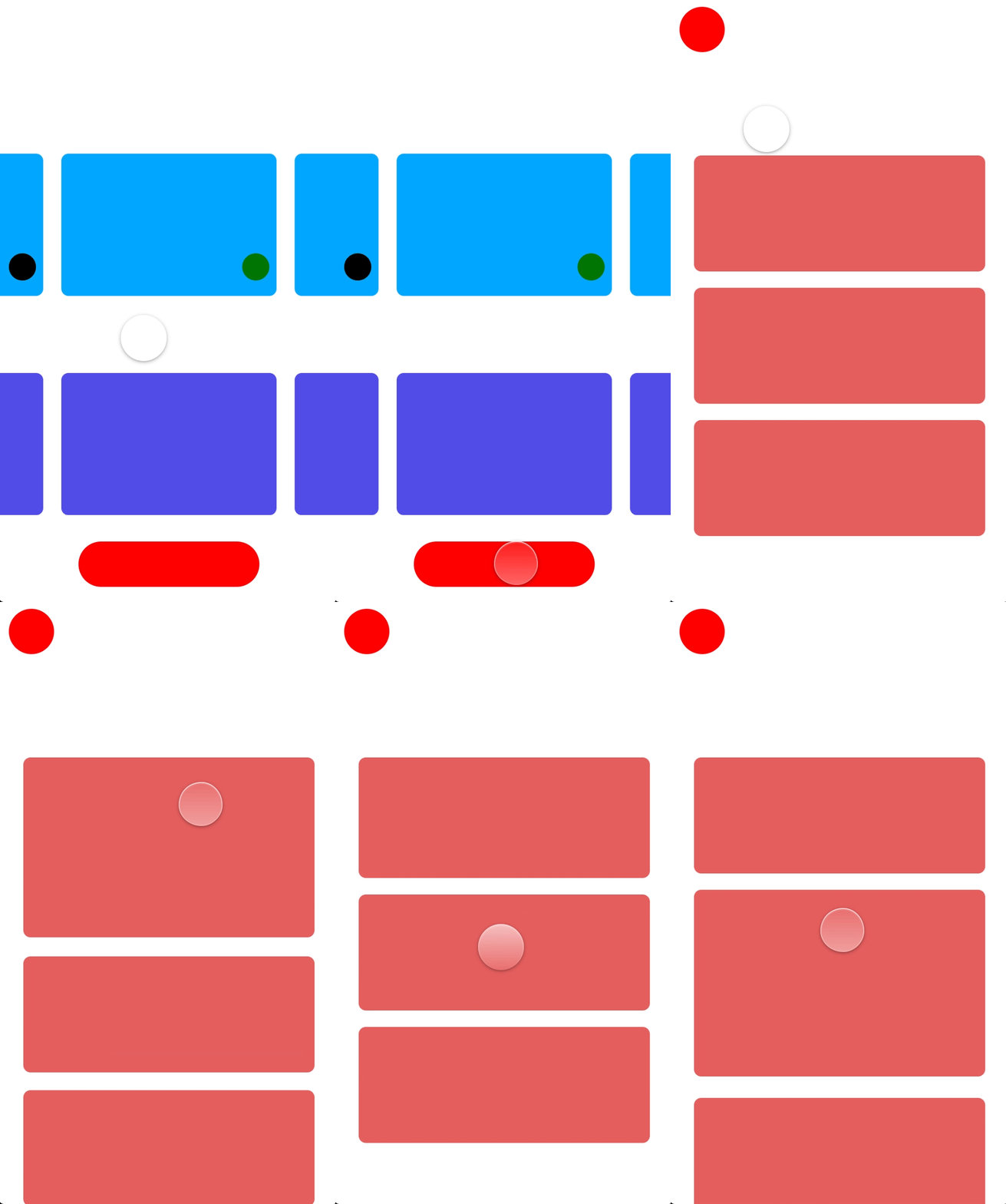
The summer of 2018, I had the opportunity to work overseas in South Korea with Naver Corporation. Naver Corp. provides web services, mobile apps, and smart devices to South Korea and beyond. Their main web platform, Naver.com is often referred to as the “google of South Korea,” and their subsidiary company, Line is the most used messaging mobile app in Japan. While at Naver Corp., I worked with the Incubation Studio, a studio within Naver that identifies emerging technology and new opportunity spaces for the company to explore.
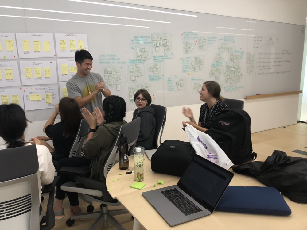
During the internship, I worked on a team of five interns to identify a problem space and product solution for users in their early twenties and design a digital service that utilizes emerging technology. The summer consisted of in-depth concept ideation, user research, design sprints, and mobile product design.
From Identifying a Problem Space to Creating a Solution
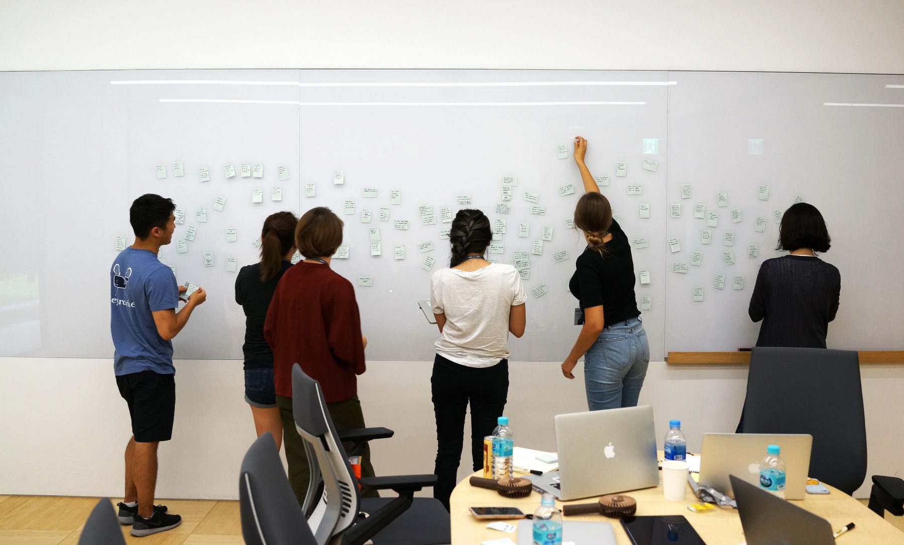
Over the course of the summer, my team and I worked through multiple rounds of iterative concept design, affinity exercises, and design sprints; we explored various problem spaces and narrowed down our scope to a single mobile application service and user workflow. From there, we designed a mobile interface to complement our concept. Much like any design process, we did not move in one straight path, but back and forth between different concepts and key features.

1. Identifying Problem Spaces
Our team began the process by first identifying problem spaces to delve deep into; we did this through mind-mapping exercises, working to come up with problem spaces in different age groups ranging from high school students to young adults in their mid-twenties. Some of these problem spaces included social impact, low self esteem, passion-seeking, and networking.
2. Creating Concise Proposition Statements
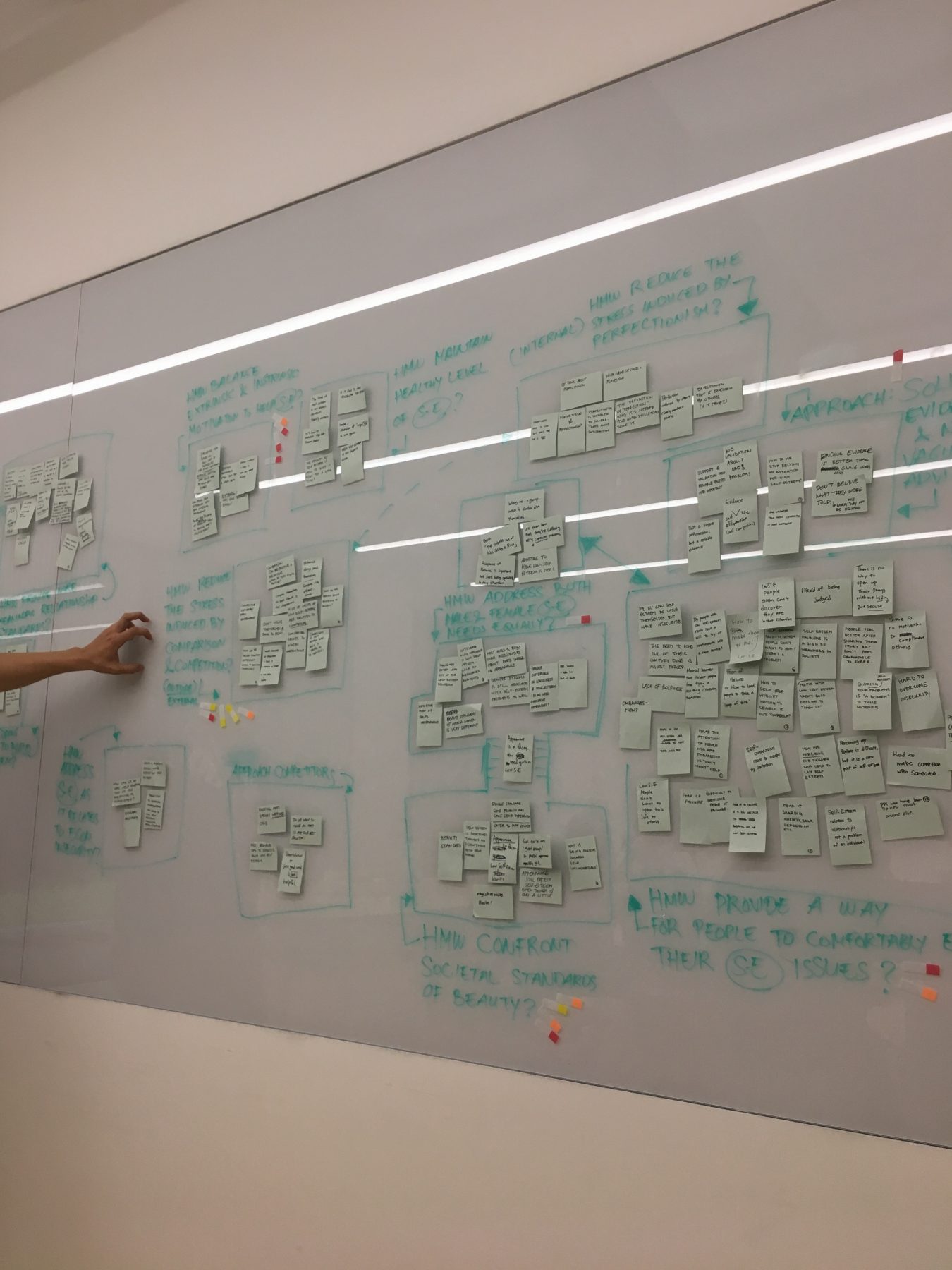
Next, we began to create proposition statements in the form of “How Might We…” statements. We identified six possible problem spaces and formed proposition statements for each problem space. Through crit sessions with mentors and preliminary competitive research, the team decided to focus on the problem space of low self esteem in young adults.
How might we reframe insecurities as areas for improvement, relieve the pressure of trying something new, and provide avenues for the user to rediscover and practice their strengths?
3. Researching Root Causes of Low Self-Esteem
By user research, competitive analysis, and research about self esteem in young adults, we began to identify key root causes of low self esteem. This research helped guide our concept-ing and ways we envisioned possible solutions. We identified indicators of low self esteem and the ways low self esteem can be effectively combatted. Three root causes emerged again and again throughout our research exploration: 1) low motivation, 2) unbalanced lifestyle, and 3) unrealistic goals.
4. Forming Key Product Statements
Through a intensive two day design sprint, the team came up with three possible solutions moving forward. We specifically focused on solutions that may not directly address self esteem, but through the solution, ones self esteem might be raised “in the background.” These three possible veins of solutions were: 1) skill sharing, 2) sharing/releasing ones feelings, and 3) teamwork through gamification and community. This step led us to two key product concepts: developing ones strength and combatting an unbalanced lifestyle.
5. Introducing Habits as Design Intervention
With these guiding principles, we began to form a more concrete idea of our solution and how it might be developed into a fully functioning product. We found that these two concepts were related through the development and practice of healthy habits, and moved forward with developing a solution around combatting low self esteem by creating healthy habits.
6. Exploring User Workflows and Key Features
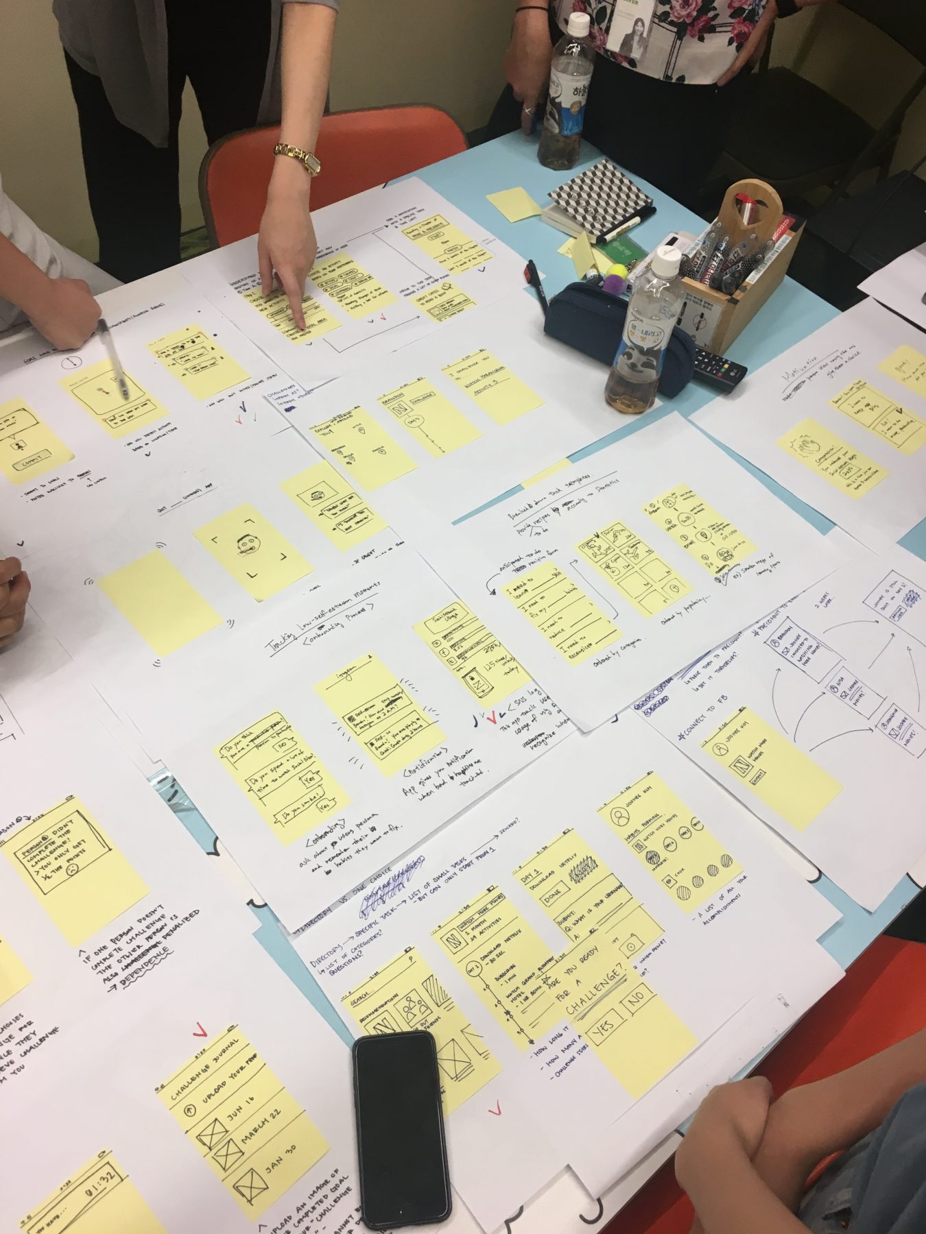
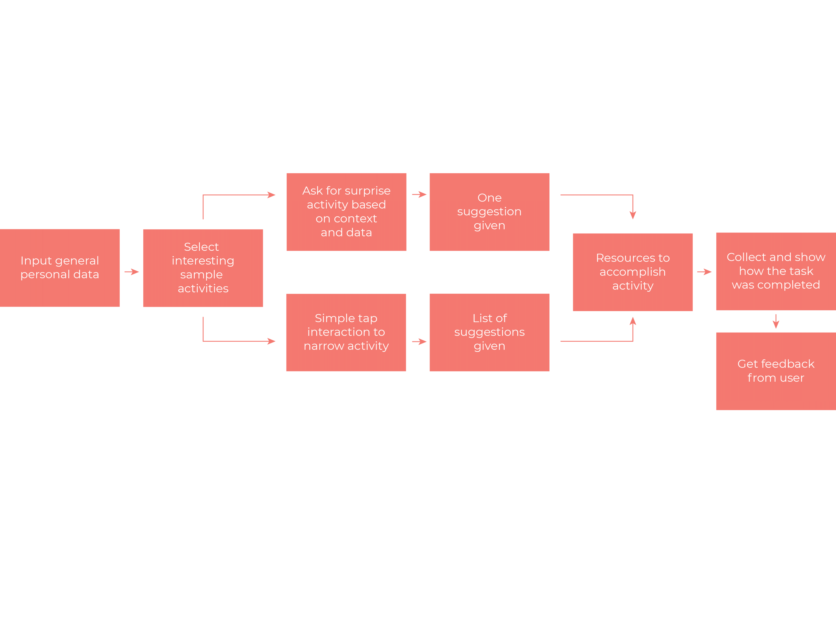
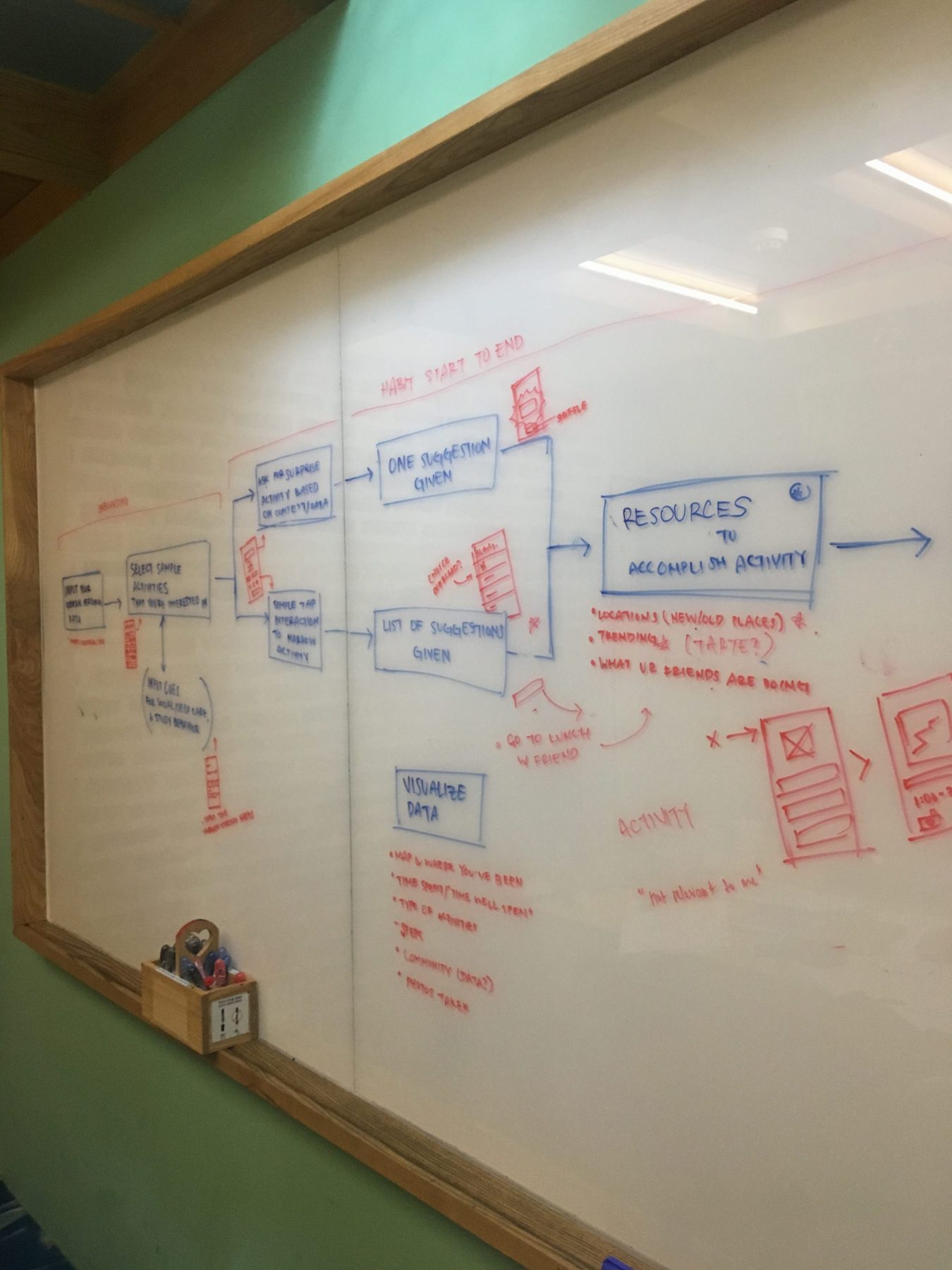
Next, we explored and ideated ways to help users make habits that would develop strengths and combat unbalanced lifestyles. The team had numerous discussions, mini design sprints, and rapid ideation exercises to form workflows and key feature ideas. Much thought was give to rewards and how to incentivize a user to make healthy habits. We also paid close attention to competitive products – what they did well and not so well.
7. Prototyping App
Finally with a concrete user workflow, ample competitive analysis, and developed key features, we began to iterate and prototype on user interface.
An environment-aware mobile app that builds positive habits by breaking down large tasks into smaller achievable steps and introduces AI-driven challenges incrementally to motivate and engage the user.
BreakMake App
After the long journey of identifying a problem space and finding a solution that accurately fit our audience and mobile medium, we began the interface and experience design. We identified areas where the app would form an engaging experiences, while also encouraging the users to raise their own self esteem. By competitive analysis, user research, and research on habits and self esteem, we identified three guiding features that the the product would follow: habit discovery, habit practice, and motivation.
We did extensive research and ideation on ways to motivate users to participate in habit-making. We thought about rewards through observed growth, gained skill, and entertainment, but none of these solutions seemed to fit our audience and our final goal. With young adults in mind, we began to re-work in previous ideas about gamification through challenges and tokens along with ideas about helping users experience more outside of their immediate location. This is where geo-location, emojis, and completing challenges to collect tokens all came together to form the BreakMake App.
A motivating app that provides small and engaging challenges for breaking bad habits and making good habits.
We used the idea of incentive and rewards to come up with a concept behind breaking and making habits. How might we motivate our user to engage with the app through encouraging them to simultaneously break a bad habit and make a good habit? We set out to answer this question by rapid prototyping and regular crits with mentors and fellow interns.
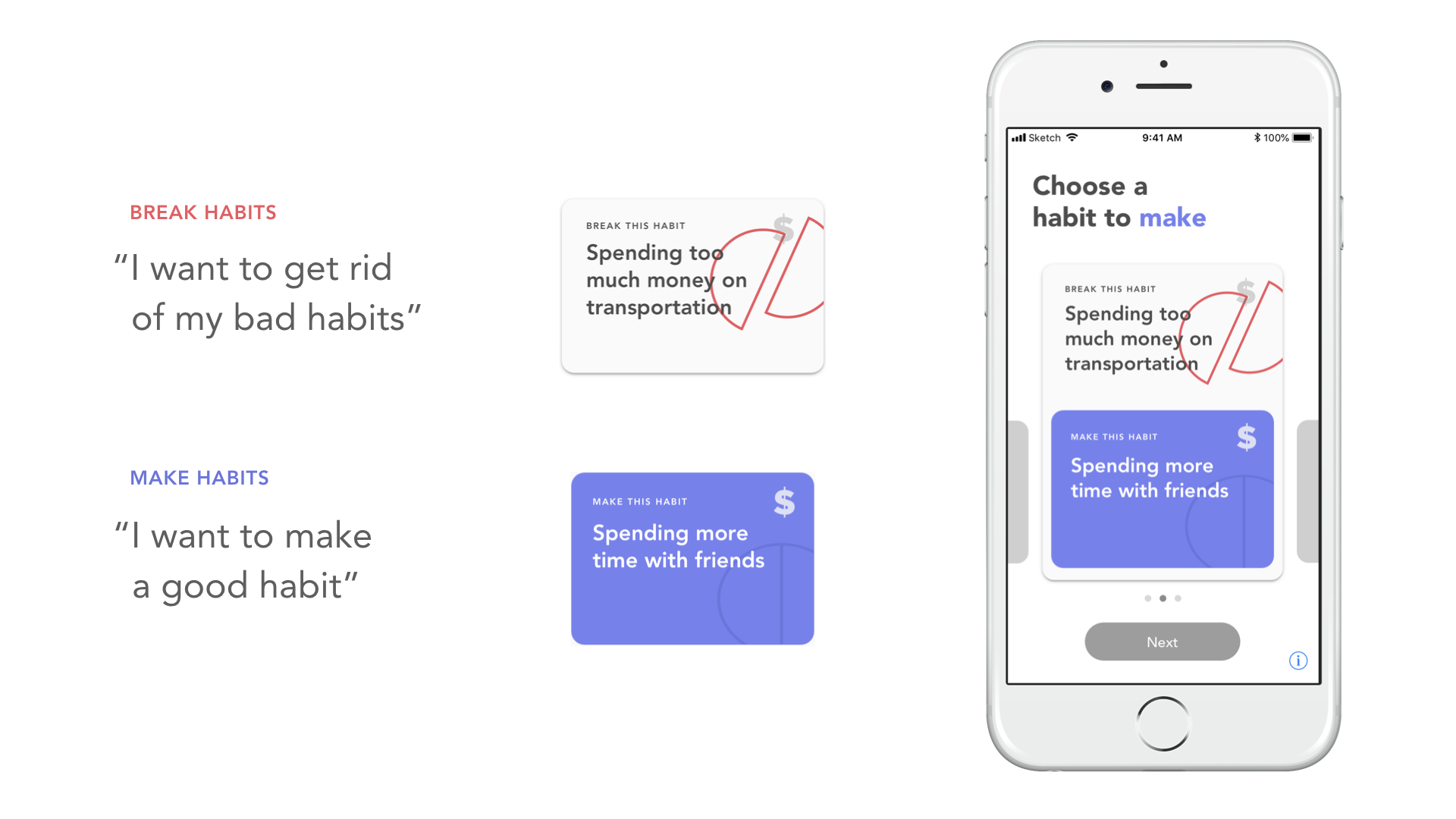
Feature 1: Habit Pairing
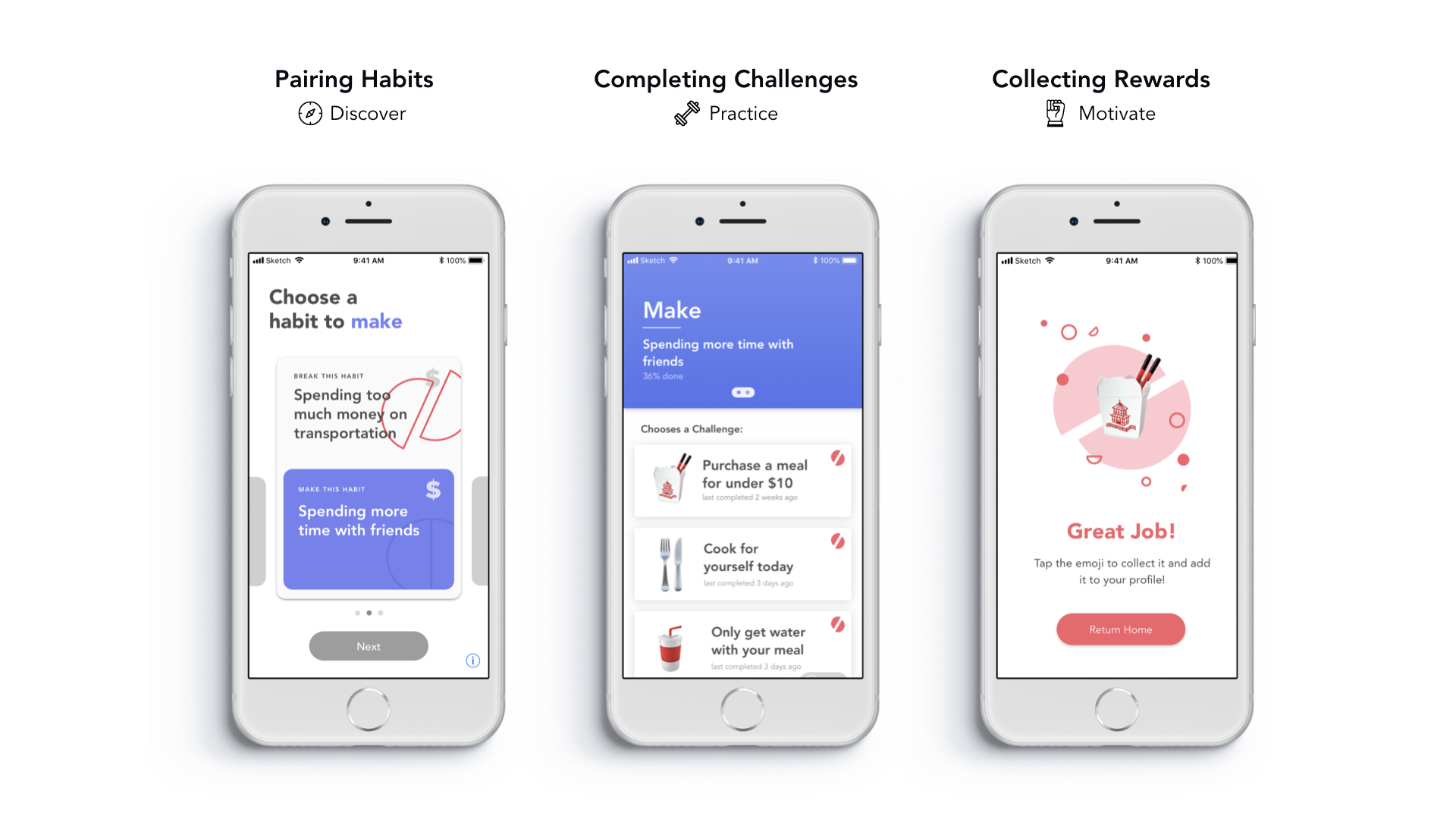
When the user first enters the app experience, they are prompted to pair two habits: one habit to break and one habit to make. This feature is the foundation by which the whole experience works as the “break habit” and “make habit” work hand in hand to motivate and reward the user.
Feature 2: Achievable Challenges
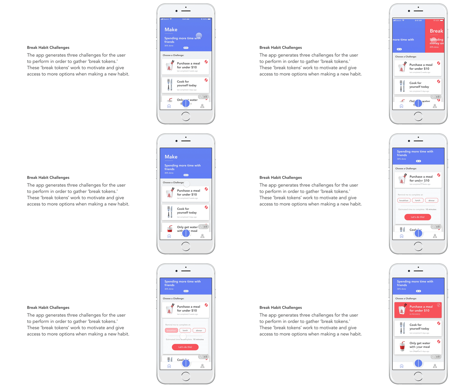
Through research we realized that habit formation works best when introduced with small achievable steps. Thus, BreakMake suggests small challenges to help the user break her bad habit.
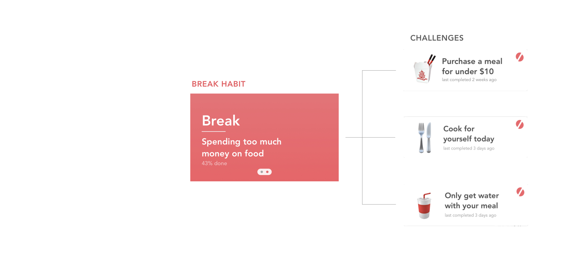
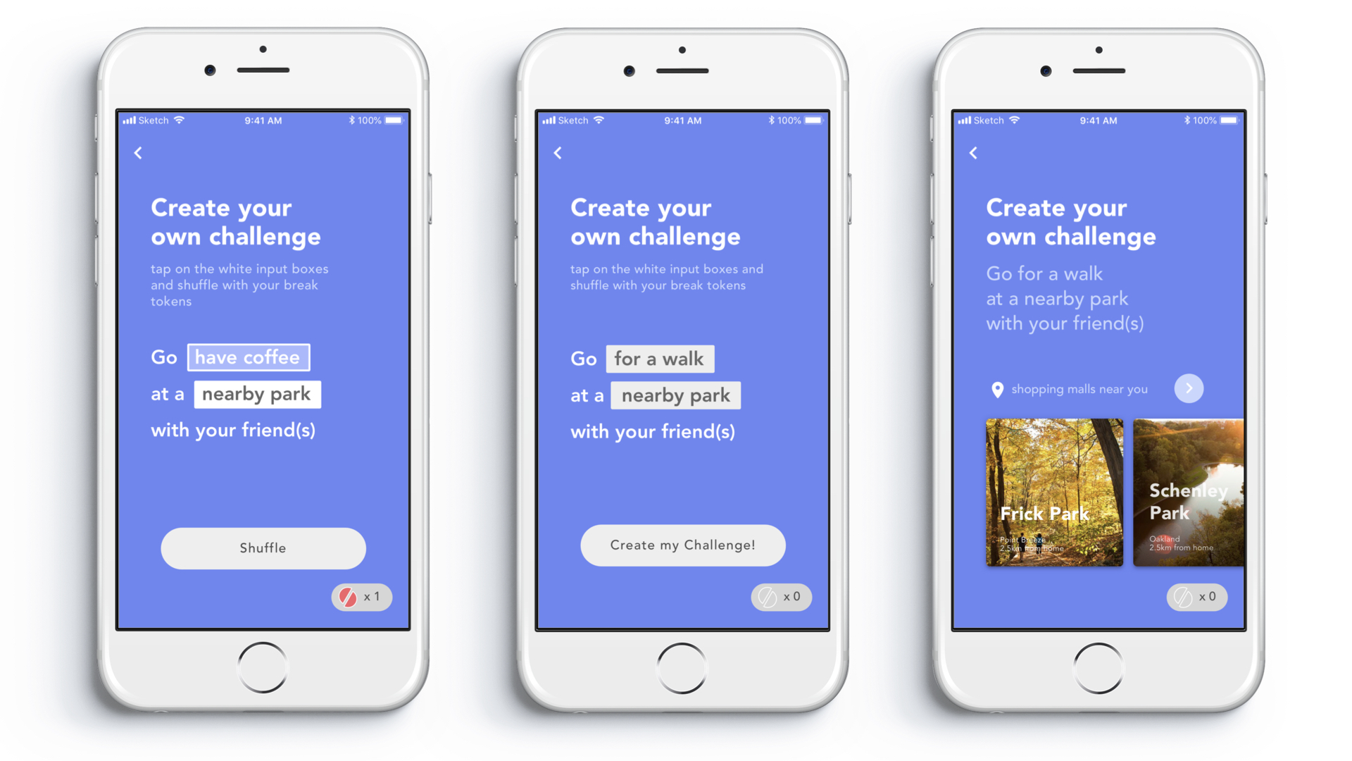
Each of these challenges are directly related to their overarching break habit and are designed to empower the user to make progress on their “make habit.”
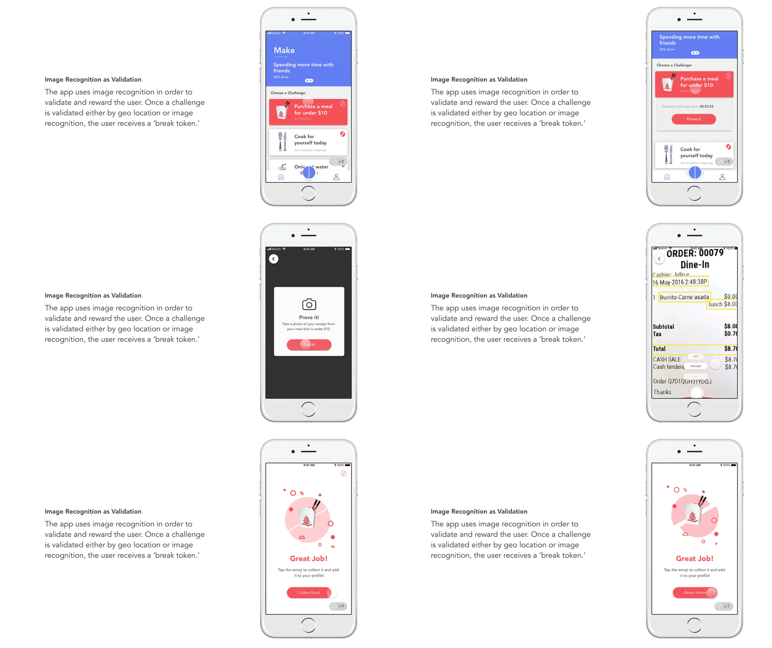
Feature 3: Rewarding the User
Collecting emojis as rewards is an important part of our app as emojis are a playful and fun way for college to students to visualize their progress. Every time the user commits to completing a challenge, they must prove or validate their completion through image recognition. Then they will receive an emoji, which turns into a “break token.” Break tokens give the user more abilities to complete their “make habit.” This is why the user is motivated to complete more challenges that break their bad habit, so that they are enabled to make good habits.
